Whether you’re starting a business or creating a brand, a logo is a must-have! Logos make businesses visible to the public and make consumers aware of their products. It is not just a design but a piece of information that even those who can’t read or know the language will be able to recognize just by looking at the logo.
Logos are not only for businesses; they are everywhere, from the phone you are holding to the shoes you wear. But think about it: have you ever stopped to look closely at them? Many famous companies don’t just design their logos to look attractive; they hide clever meanings and secret messages inside them. These covert elements are often subtle, but once you notice them, you will never look at those logos the same way again!
Here are some of the most famous brand logos with hidden messages you may have missed:
Beats by Dre
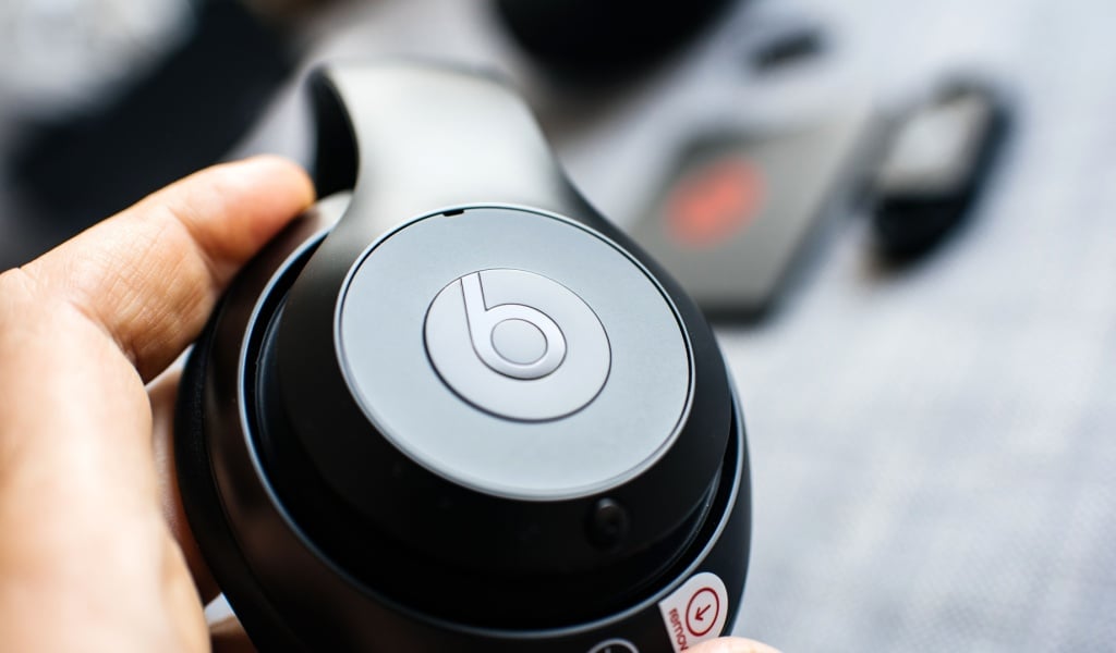
The logo for Beats by Dre looks like a simple red circle with the letter ‘b’ inside, but a closer look reveals more. The circle represents a human head, and the ‘b’ looks like headphones placed on the ear. It is a smart way of showing what the brand is all about without being too obvious.
FedEx
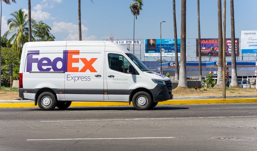
At first glance, the FedEx logo looks simple: bold purple and orange letters – but that’s not all it is. Zoom in between the E and the x, and you will notice a white arrow. This arrow represents speed, precision, and forward movement, which perfectly matches the brand’s identity as a fast and reliable courier service.
Amazon
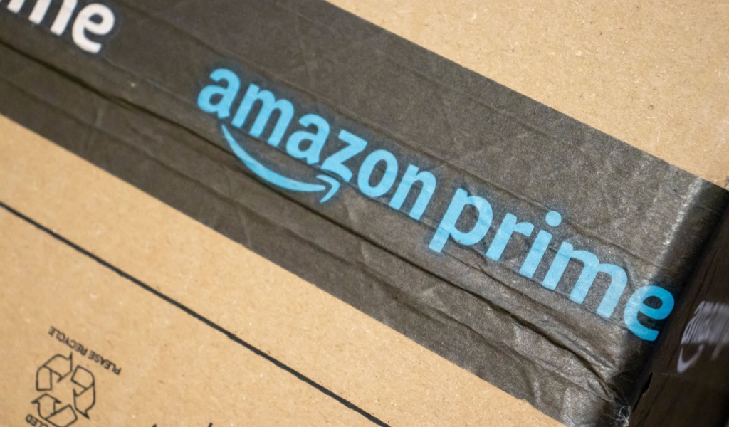
Amazon’s logo is one of the most recognized worldwide. The orange arrow under the name might look like just a smile, symbolizing happy customers. But if you look carefully, the arrow goes from A to Z, showing that Amazon sells everything from A to Z. The logo cleverly combines both ideas: customer satisfaction and a massive range of products.
Toblerone
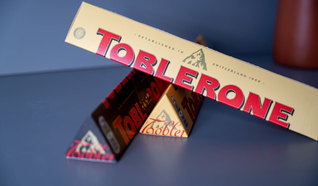
The famous Swiss chocolate bar Toblerone shows a mountain range in its logo, representing the Swiss Alps, but that’s not all that’s there. The logo also features a bear, representing the city of Bern, Switzerland, also known as the City of Bears, where Toblerone originated.
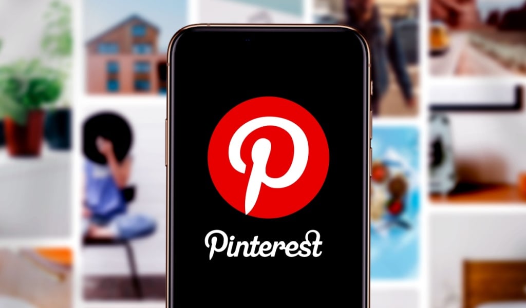
Pinterest is a social media platform that people depend on for design and creative inspiration. The primary function of the site is that users can save or “pin” posts that they like. The logo, too, plays into this idea. At first glance, it may seem like a red circle with a P, but have you ever noticed that the letter is designed to look like a pin itself? It is a simple yet innovative way of visually connecting the brand’s purpose with its design.
Baskin-Robbins
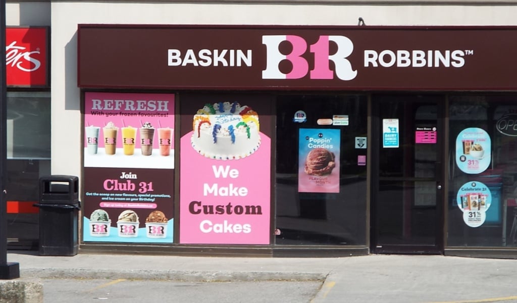
Baskin-Robbins is famous for its ice cream, especially its variety of flavors. Their logo has the letters ‘BR’ in pink and blue. But hidden inside the pink part is the number 31, representing the brand’s promise of 31 different flavors, one for each day of the month.
Hyundai

Most people think Hyundai’s logo is just the letter H standing for Hyundai. But it also has another meaning: the H shows two people shaking hands, with one representing the customer and the other the company. The logo is meant to convey trust and a good relationship between Hyundai and its customers.
Toyota
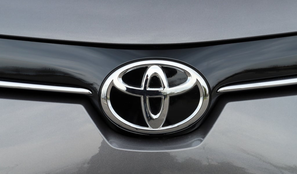
Toyota’s logo may look like just three overlapping ovals. But if you look closely, you can actually spell out every letter of the word Toyota using the shapes of the ovals! It’s a logo full of hidden details that reflect creativity and careful design.
Tour de France
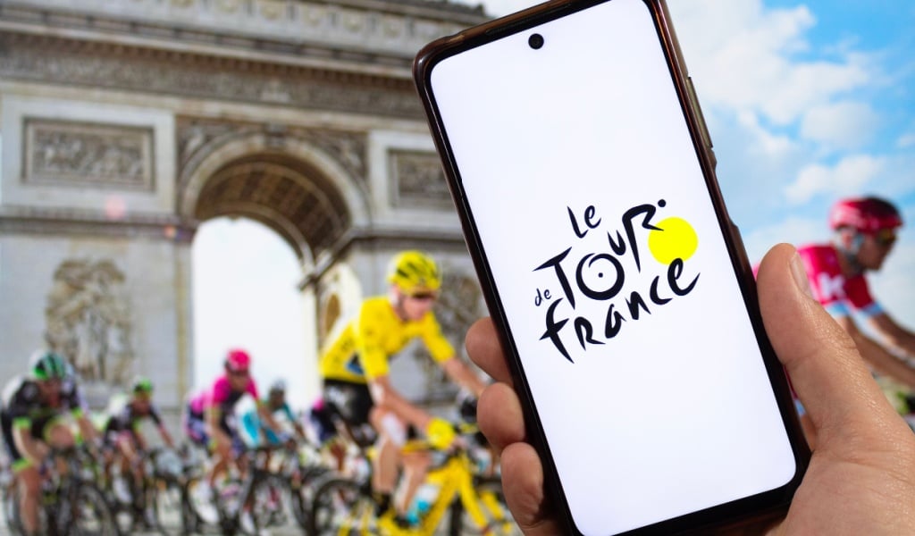
The Tour de France cycling race has a very clever logo. The word Tour has a hidden design; the letter O is made to look like the wheel of a bicycle, and the yellow circle next to it represents the sun. Together, they depict a cyclist in action, perfectly capturing the essence of the famous biking event.
NBC – National Broadcasting Company
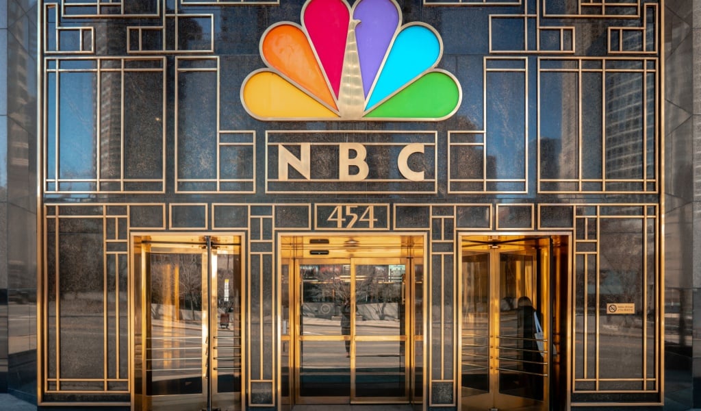
NBC’s colorful logo resembles a rainbow fan. But if you focus on the white space in the middle, you will notice a peacock facing to the right. The peacock represents NBC’s motto of looking forward with pride and innovation.
Gillette
Gillette’s logo looks like simple text at first, but further analysis of the letters G and I reveals that they are cut sharply, mimicking the effect of a razor blade’s precision cut. It is a subtle mirroring of what the brand is known for: sharpness and perfection.
Carrefour
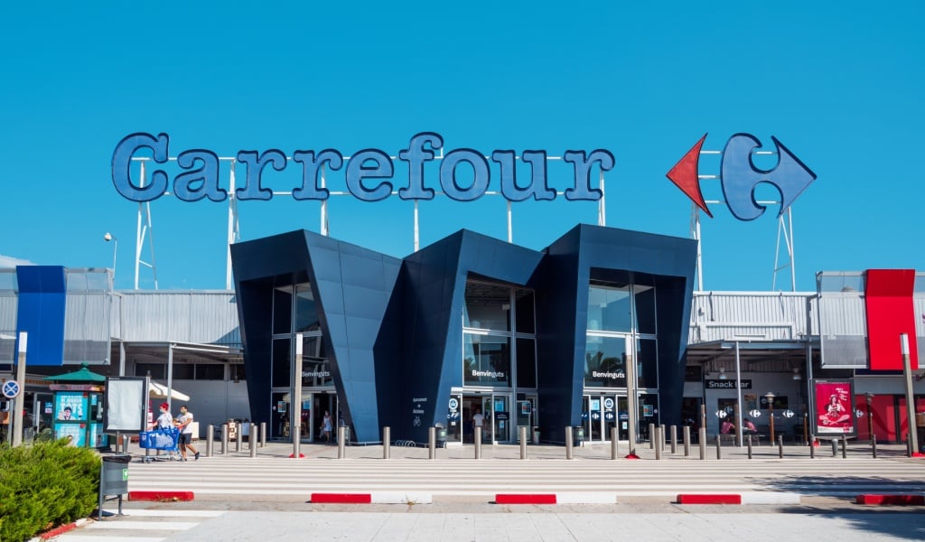
Carrefour is a French supermarket chain, and its name means crossroads. The logo features two arrows pointing in opposite directions, with a white space between them, demonstrating the letter C for Carrefour.
Apple

Apple’s logo is simple: just an apple with a bite taken out of it. Many think it is just to make the apple recognizable, but the bite also represents a byte, a digital term. This small detail cleverly connects the fruit with the digital world.
Subway
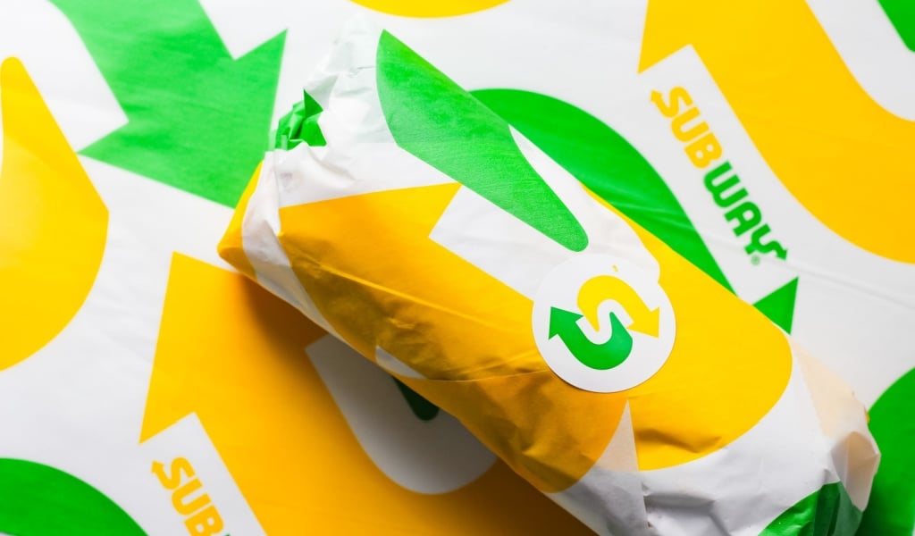
The Subway logo features arrows on the letters S and Y, symbolizing entrances and exits that represent the idea of movement and travel, much like people entering and exiting a subway station. It also connects the brand to the concept of fast food on the go.
Why Do Brands Hide Messages in Logos?
Logos are more than just pretty designs. They are visual stories. By hiding symbols, messages, or meanings inside a logo, brands can:
- Make their logos more memorable
- Create a stronger connection with customers
- Show their creativity and uniqueness
- Add an element of surprise that keeps people talking
Conclusion
Next time you think of creating a logo, consider a hidden message that will attract your customers. And when you see a brand logo, take a closer look; you might spot a hidden arrow, a secret symbol, or even a story hiding in plain sight! Logos aren’t just about looks; they hold so much meaning. That is what makes them powerful and timeless.
So, the next time you unwrap a Toblerone, order from Amazon, or see a FedEx truck pass by, you will know there is more to those logos than meets the eye!


